

The Spaghetti Diagram
The Simplest Way to See What's Actually Broken in Your Operations
There's a tool I come back to over and over again — whether I'm working on a Fortune 500 supply chain or helping a 10-person service business figure out why everything feels so hard. It doesn't require software. It doesn't require a certification. It requires a blank piece of paper, a pen, and about 30 minutes of honesty.
It's called a spaghetti diagram. And if you've never used one, it might be the most useful thing you learn this year.
So What Is a Spaghetti Diagram?
A spaghetti diagram is a visual map that traces the actual flow of movement within a process — whether that's people walking across a factory floor, materials traveling between workstations, or information bouncing between tools and team members.
The name comes from what the finished diagram looks like. When you draw every path, every handoff, and every back-and-forth on a single page, the overlapping lines look exactly like a plate of tangled spaghetti noodles. And that tangle isn't a failure of your drawing skills — it's a brutally honest picture of what's really happening inside your operation.
The concept comes from Lean Six Sigma, a methodology focused on eliminating waste and improving efficiency. In manufacturing, spaghetti diagrams have been used for decades to expose unnecessary motion — a worker walking back and forth across a floor 40 times a day, or a part traveling twice the distance it needs to between stations. Once you can see it, you can fix it. But as long as it's invisible, it stays broken.
It's Not Just for Factories
Here's where most explanations of spaghetti diagrams stop — with factory floors and warehouse layouts. But this is where things get interesting for the rest of us.
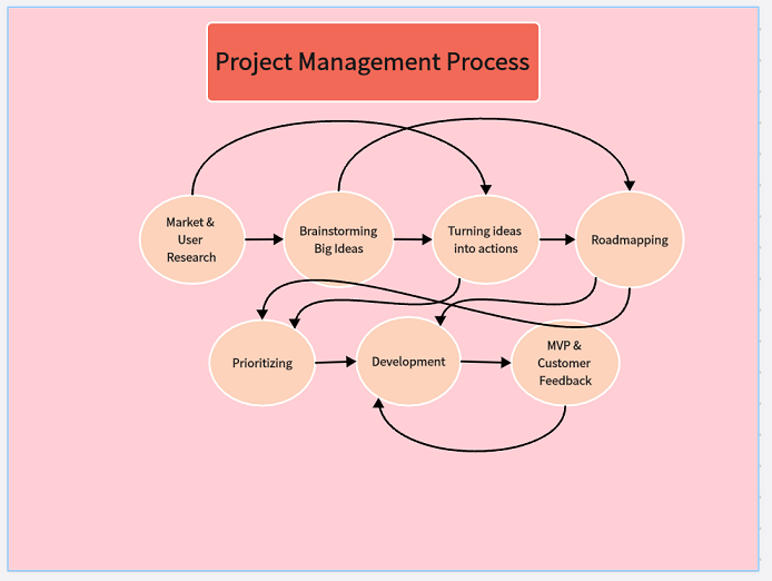
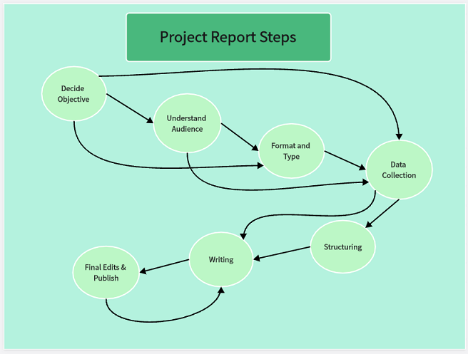
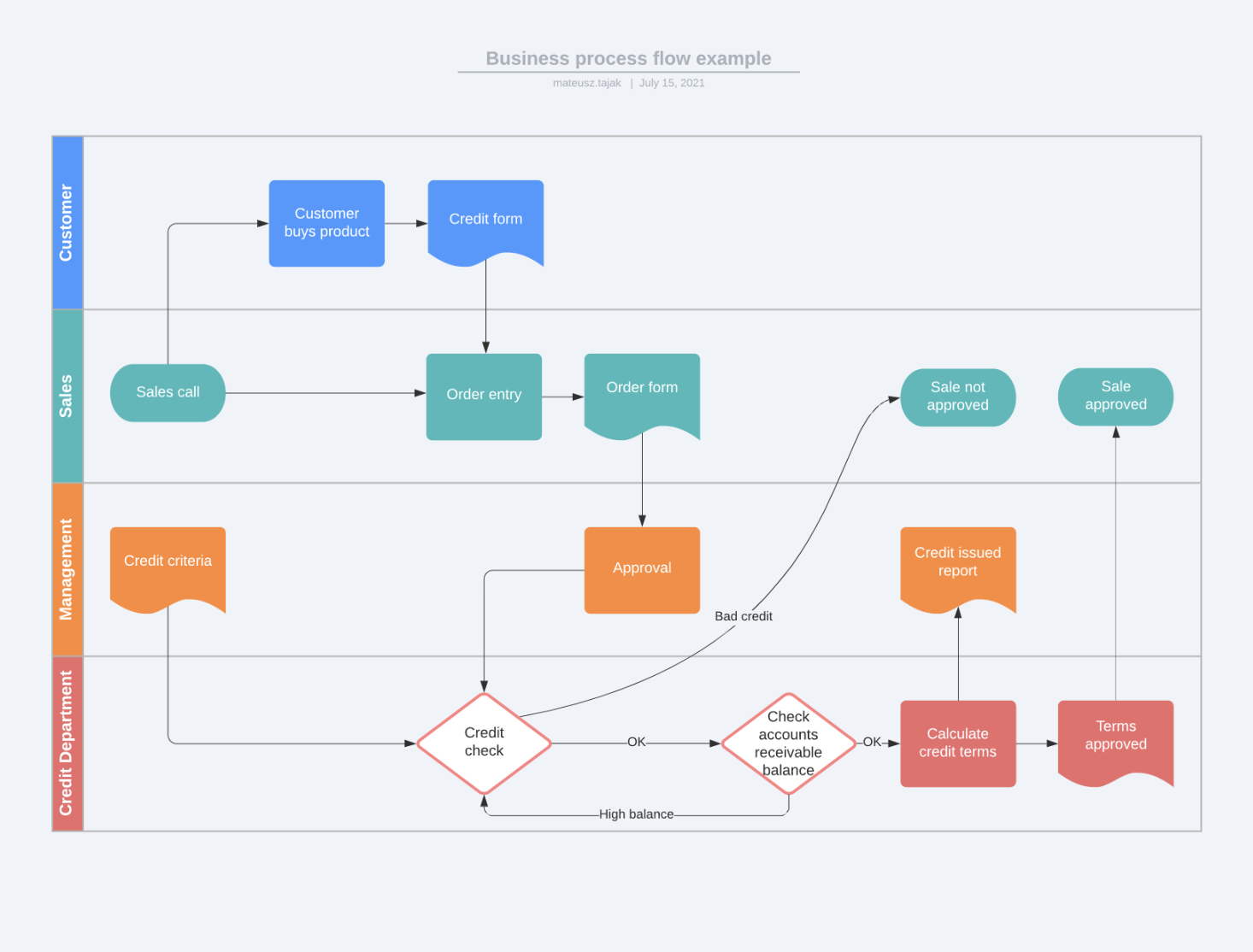
The same principle applies to any process where things move from point A to point B, even when the "things" are digital. In a service business, you're not tracking a worker walking across a warehouse. You're tracking how a client inquiry moves from first contact to signed contract. You're tracking how a project brief travels from the sales team to the delivery team. You're tracking how an invoice gets created, approved, sent, and reconciled.
And when you map those flows honestly, they look just as tangled as any factory floor.
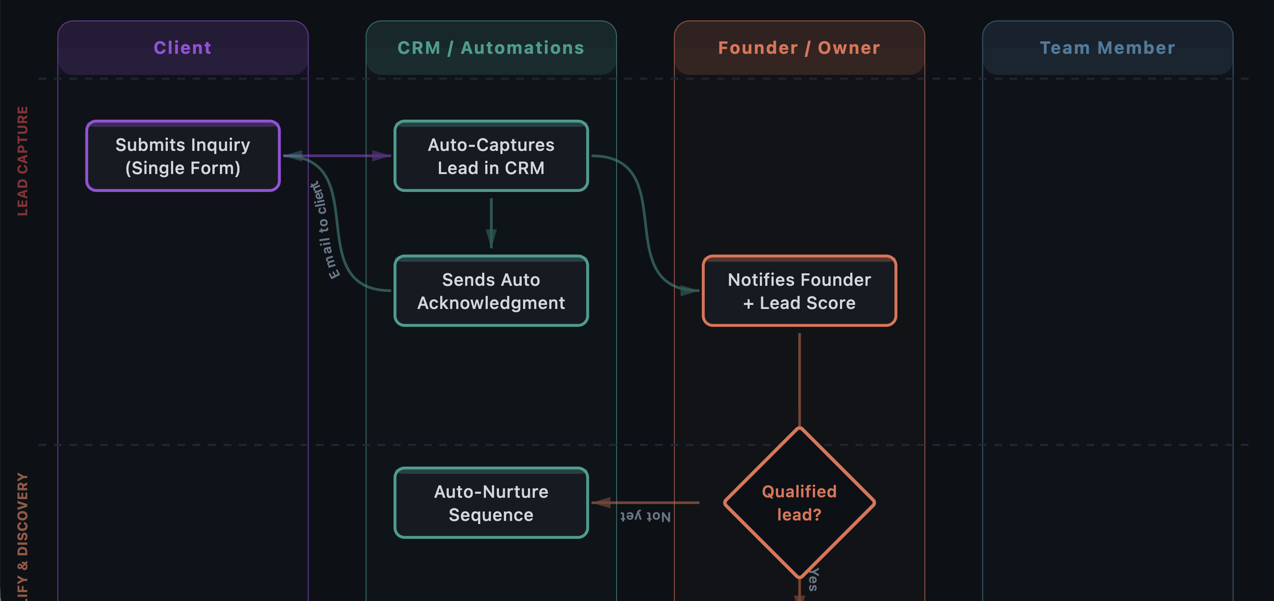
Think about your client intake process. A lead comes in through the website or a referral. It goes to someone's email — maybe a form, maybe not. Then someone copies that information into a CRM, or a spreadsheet, or both. There's a follow-up call, but who sends the confirmation? Where do the notes go? If that process touches more than three tools and involves someone copying and pasting information anywhere in the chain, you've got spaghetti.
How to Create a Spaghetti Diagram
The beauty of this tool is its simplicity. No special software required.
1. Choose one process
Pick the process that causes the most friction, delays, or confusion in your business. Don't try to map everything at once — focus on a single workflow from beginning to end.
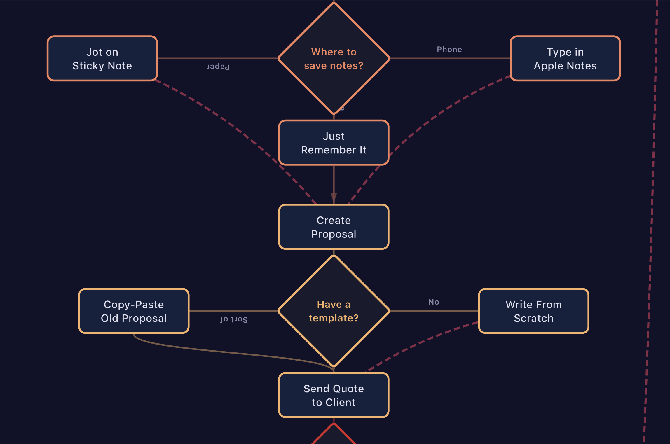
2. Draw the current state — not the ideal one
This is the most important rule. You're mapping what actually happens, not what's supposed to happen. Include the workarounds, the "oh and then I also text Sarah about it" steps, the copy-pasting between systems. All of it.
Use simple notation:
Boxes for actions and steps (e.g., "Send proposal," "Log data in CRM")
Diamonds for decision points (e.g., "Did the client respond?")
Arrows for handoffs and transfers between people, tools, or stages
For physical processes, draw the arrows on an actual layout of the space. For digital or service processes, draw the arrows between the systems and people involved.
3. Don't clean it up
Resist the urge to make it neat. The messiness is the point. If your diagram looks organized and tidy, you're probably leaving steps out. A real process, mapped honestly, almost always looks chaotic — and that chaos is information.
4. Look at the tangle
Once it's all on paper, step back. Count the arrows — every arrow represents a handoff, a transfer, a moment where something moves from one person or system to another. Count the tools involved. Notice where the same information gets entered more than once. Notice where arrows loop back on themselves.
If you have more arrows than people on your team, that tells you something important about where complexity lives.
What to Look for in Your Spaghetti
A spaghetti diagram doesn't fix anything by itself. Its power is in making the invisible visible. Once you have your map, look for three things:
Where information gets stuck. These are the points where things stall because someone is waiting — a file sitting in an inbox, a team member asking "did the client confirm?", a draft waiting days for approval. Every one of those is a bottleneck.
Where humans do what systems should. Look for places where someone is manually moving data between tools — copying from a form into a spreadsheet, re-typing invoice details, sending a reminder that could be automated. That's not productive work. It's expensive and error-prone.
Where the same paths keep crossing. In a physical space, this means congestion and wasted motion. In a digital process, this means redundant steps — information passing through the same person or tool multiple times when it shouldn't need to.
The spots where your diagram is the most tangled are almost always where your biggest operational problems live. They're the leaks where time and money drain out every day.
Why It Works
The spaghetti diagram works because it externalizes what usually lives in people's heads. In most growing businesses, processes develop organically — built on the fly by people figuring things out as they go. That scrappiness is what got you to where you are. But it also means your workflows exist as tribal knowledge, spread across inboxes, chat threads, and individual habits.
You can't improve what you can't see. You can't delegate what you haven't defined. And you can't make a meaningful decision about which tool to buy or what to automate until you understand what's actually happening.
A spaghetti diagram gives you that understanding in 30 minutes with a piece of paper. It's not sophisticated — and that's exactly why it's so effective.
A Quick Challenge
Pick your most painful process. Give yourself 30 minutes. Draw every step, every tool, every person, every handoff. Don't skip the messy parts.
Then count your arrows. If the number surprises you, you just learned something valuable about your business.
Ysimer (Ysi) González is the founder of Altamira Ops, a fractional COO consultancy based in Montreal serving businesses across the US and Canada. With 18 years of Fortune 500 supply chain and operations experience and a Lean Six Sigma Green Belt certification, she helps growing companies fix operational chaos before they scale. Reach her at ysi@altamiraops.com or visit altamiraops.com.